Ms. Hanke, why does a company need a corporate design in the first place?
Hanke: "A corporate design defines how a company wants to present itself visually." It is a fundamental component of the brand and represents what a company stands for. People perceive colors, shapes, fonts, and images very quickly and intuitively. Even before we read texts, they evoke feelings and associations. A consistent brand image can therefore build trust, provide guidance, and clearly convey the message: This is TRUMPF. It also sets us apart from competitors and makes us unique and recognizable as a company."
And what does TRUMPF stand for?
Hanke: "We repositioned the TRUMPF brand over the last year. Our brand values are clearly defined: We want to be seen as forward thinkers, experts in understanding our customers, trailblazers, and a guarantee of quality. It was precisely the sense of partnership and closeness that sets us apart at TRUMPF and that was not reflected in the old corporate design. It was rather cool and distant.
We have visually interpreted the emotional qualities that TRUMPF stands for in various ways within the new corporate design. The new brand color, Deep Blue, symbolizes a guarantee of stability and reliability. The bright, bold Energetic Blue represents the forward-thinker, i.e. technology and the future. The warm shade of purple represents an understanding of and proximity to our customers. And the Laser Green stands, among other things, for sustainability. Together, these colors form a pallet that combines our technical expertise with a sense of warmth and emotion, while remaining modern and future-oriented. Attentive readers will notice that we have used the colors of light from our tools, just like a beam of light in physics ranges from purple to green."
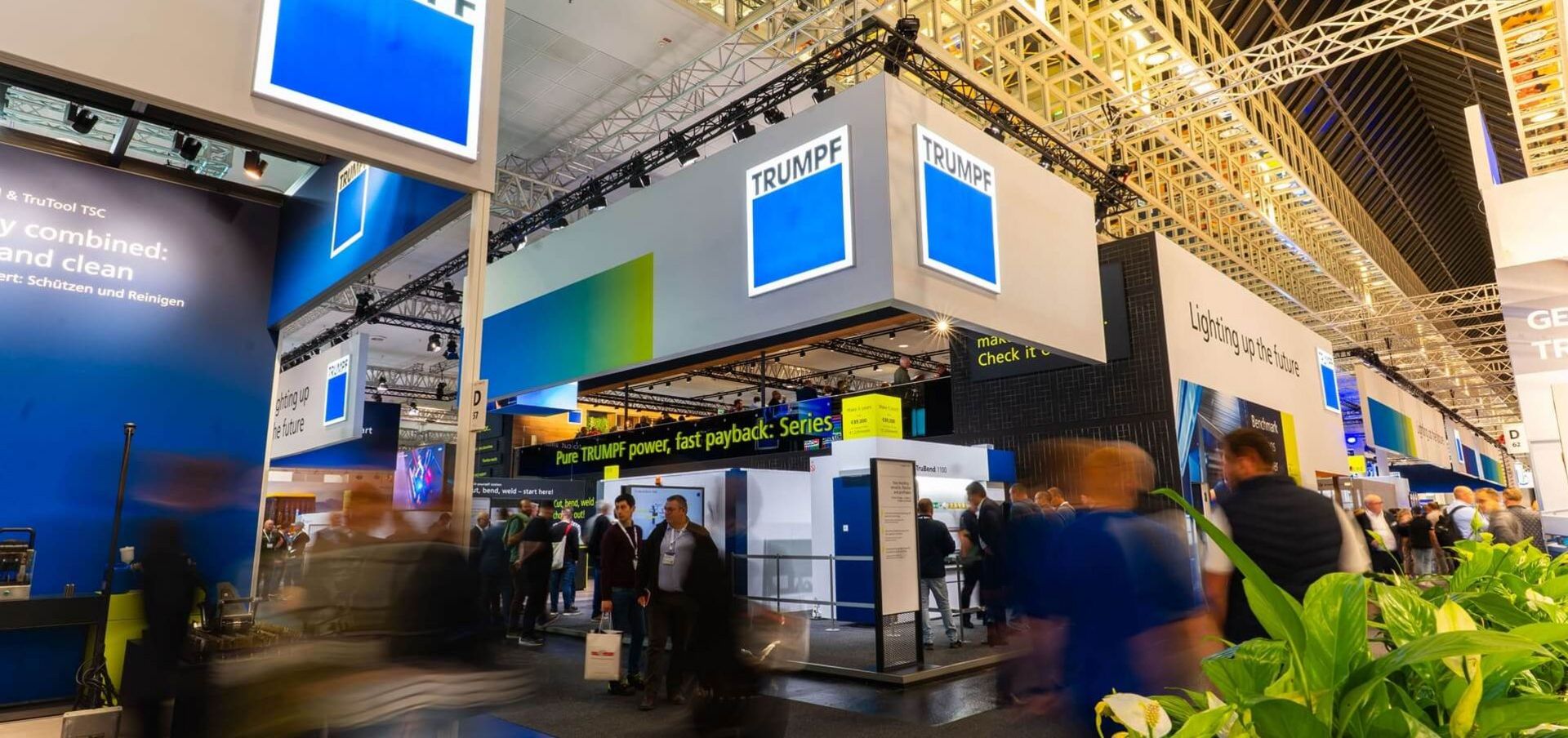
TRUMPF at EuroBLECH 2026
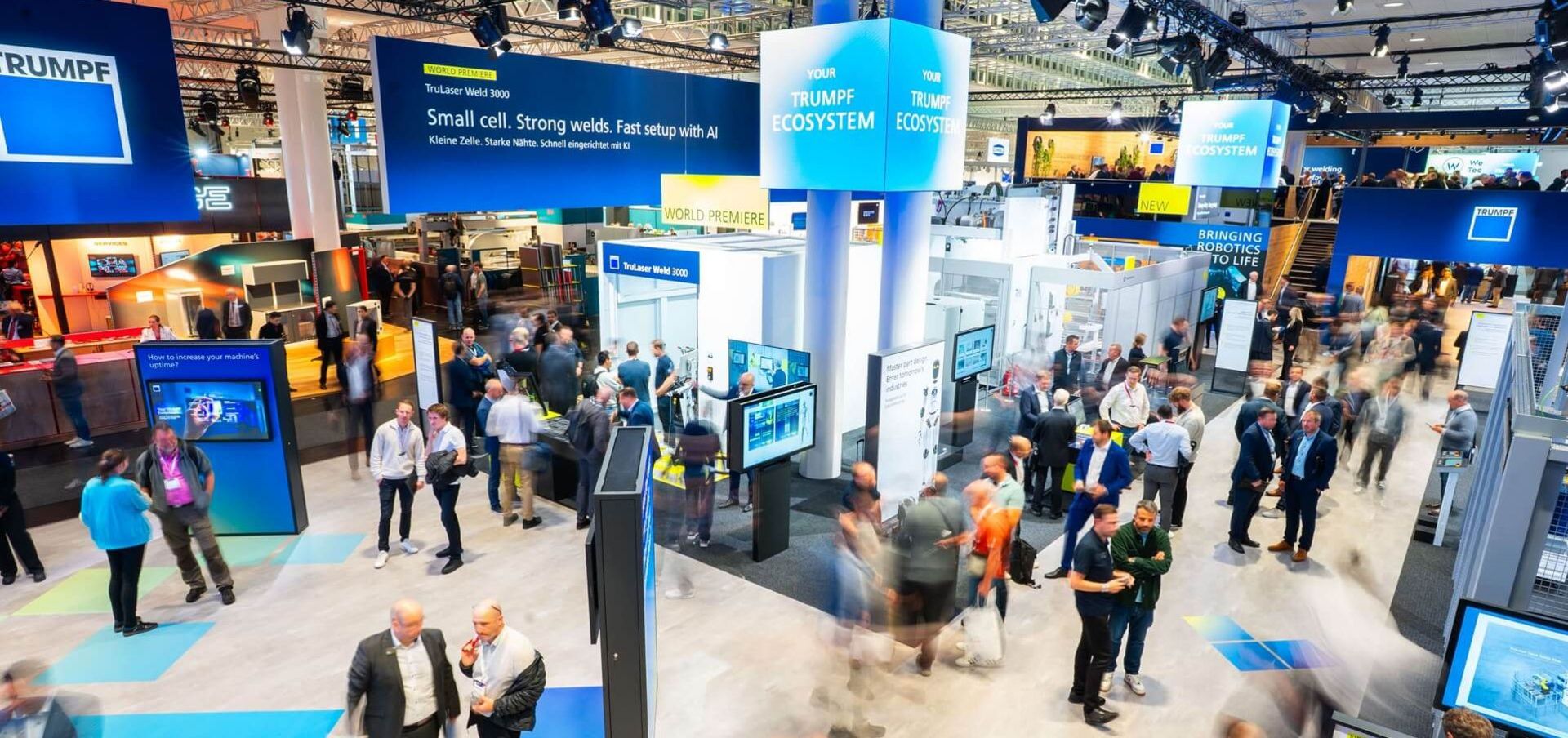
The new corporate design was also showcased at the trade fair.
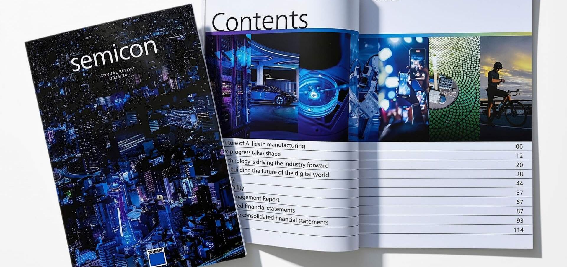
The TRUMPF 2025/26 Annual Report also features the new look & feel of the corporate design.
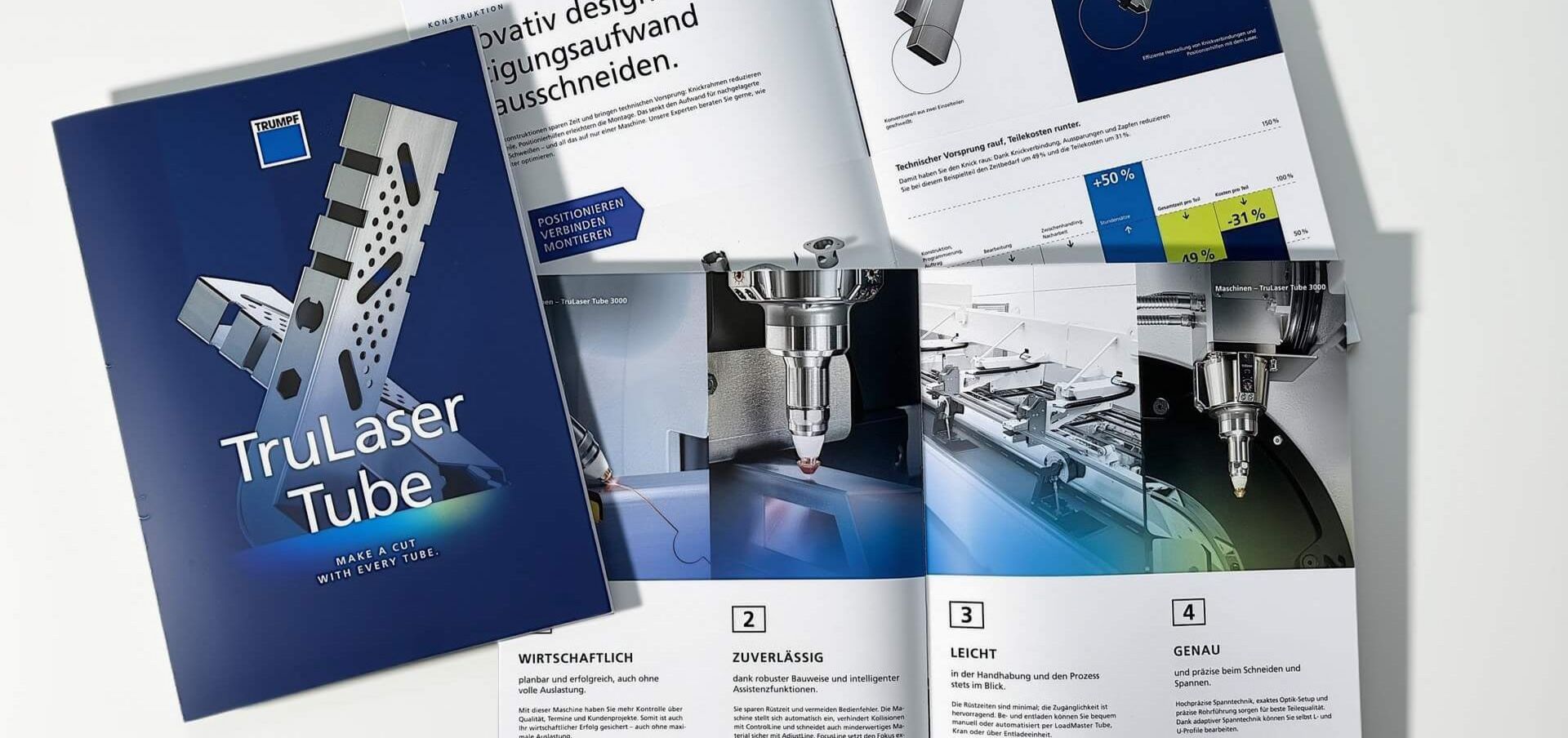
More color for our products - with a spectrum ranging from purple to green.
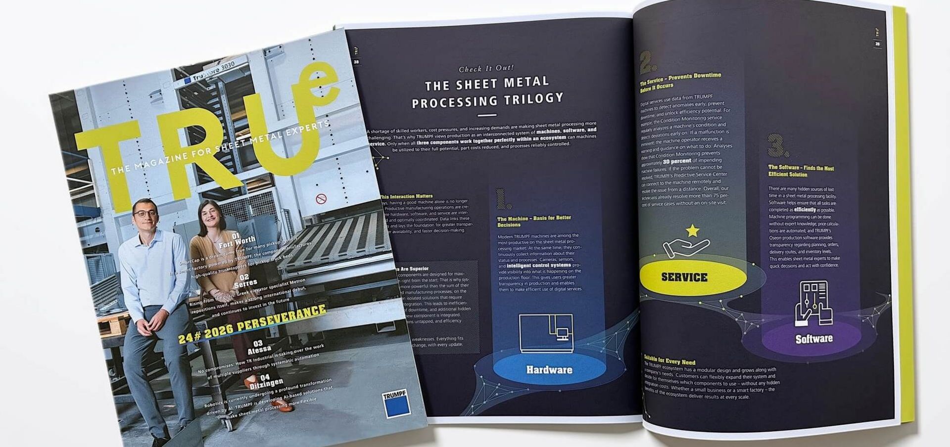
Our customer magazine, TRUe, also incorporates elements from the new color palette.
How would you describe the new appearance in three words?
Hanke: "Emotional, down-to-earth, and versatile. The new corporate design is like a beautiful musical instrument or a painter's palette: it creates vibrations and opens up many possibilities. It is precisely this emotional appeal that was missing from the earlier design of the TRUMPF brand."
Have you designed this all yourself?
Hanke: "No, not at all. We worked with our agency to develop, discuss, and refine many ideas. The drafts were then presented to various committees and further developed. One of the biggest challenges was turning a creative idea into clear and understandable rules. After all, people who are not designers must be able to work with it too - all around the world, in subsidiaries, in marketing teams, or at agencies. When it is being used, it will become clear where adjustments need to be made. A corporate design is therefore never 'finished' but continues to evolve as it is implemented."
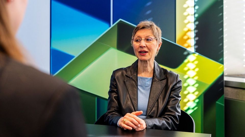
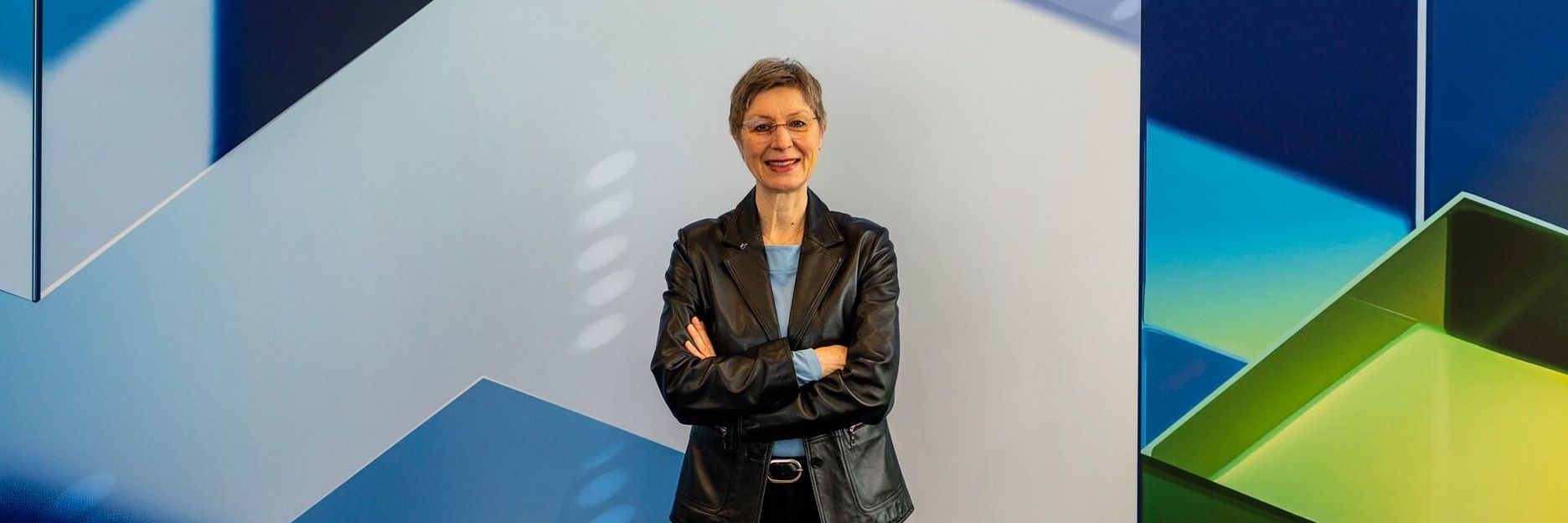
Birgit Hanke has worked at TRUMPF for 30 years and is responsible for corporate design & naming: "I am inspired by the ability to present a company in a way that combines an attractive visual identity with its technological substance."
How have employees and the public reacted to the new brand identity?
Hanke: "We are getting a lot of positive feedback, especially from departments that work closely with customers and from agencies that are using the new design. Some of our colleagues had to get used to the bold colors at first. Nowadays, many people like to use them. There were also very positive reactions on social media and about the campaigns. For the general public, the new brand identity will be most visible on the website (example), in videos, on social media, and at trade shows. Visitors to last week's EuroBLECH trade fair certainly noticed it, and regular website visitors and social media followers of our TRUMPF channels certainly noticed the color change as well."
Last question: What is your personal favorite element?
Hanke: "The soft horizon - it is like an electric arc sweeping across the sky like the aurora."